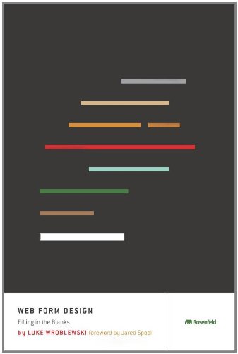
Good Read: Web Form Design by Luke Wroblewski

TL;DR
- Broad overview of all the considerations that constitute good form design
- Not technical and easily digestible
- Includes the why, what and when of best practices based on experience and research
- 226 pages - 14 Short focussed chapters
Why read this book?
Given much of my current day to day work is presenting web forms for gathering data from users and putting that data in one system or another, I decided that it would be worth revisiting some of the web form design classics in order to generate some new inspiration around our current designs and usability. I have a copy of 'Don't make me think' by Steve Krug and 'Web Form Design' comes highly recommended by other reviewers of that book.
The book is a collection of insights and best practices for Web form design. Chapters cover form structure and organisation as well as the individual form elements and interactions.
Even though it is almost 10 years old, the fundamentals are still sound and relevant to today's design challenges such as mobile. In fact, as I read through the book it was interesting to me just how many of the book's practices are evident in many of the current crop of website frameworks such as Bootstrap.
Inspirations
My original aim was to generate some inspiration and I feel that I've gained some from reading this book.
Consistency
I certainly don't claim to be a designer but educating myself on the fundamentals has given me a toolkit of ideas and patterns that can be applied, much like software architecture principles.
In my current position, I am responsible for maintaining some projects that have been written and owned by a number of teams and developers over time. This has invariably led to a number of inconsistencies with the form designs. The book advocates consistency across a system to avoid overloading the user, so I'm hoping to use the book as a reference for applying a consistent approach to areas such as error handling, form fields, headings, text and actions. Incrementally updating those areas should improve the user experience.
Gradual engagement
In the penultimate chapter, the author writes about killing the sign-up form and moving to "Gradual engagement". A process whereby a user does not need to explicitly sign up and get a username and password but is silently "adopted" by the system they are using.
One of the systems that I work on is for Personal Loan applications. This uses a typical wizard approach of gathering a customer's data over a number of steps in order to apply for a Personal Loan. In this wizard, we currently have a step exclusively for putting in an email, password and security question to create an account that is attached to the loan application. The account gives the user access to their details and application decision.
I had been exploring the possibility of a passwordless mechanism to remove the need to create an account purely for the application process, thus reducing the number of steps in the wizard and putting more burden on the user to remember another username and password combination. The suggested email approach is probably a little too much burden in terms of having to wait for emails to sign in but helps in getting out of the user's way.
The "adoption" approach could also remove the create account page altogether. In this scenario, a user account is created once the user has entered an email address as part of their contact details. In order to access the account later, the user would need to validate against some data that we have captured such as date of birth.